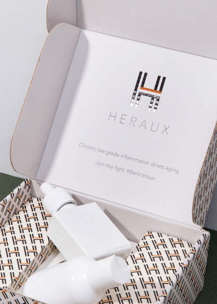
When we think about what distinguishes a brand, what comes to mind?
Most likely, one of the first thoughts you had was color.
After all, what would products like Coca-Cola be without their famous red color?
Colors make a significant difference in brand perception and recognition, so it’s such a crucial aspect to consider.
Depending on the product, demographics, and other vital factors, colors can help your branding stand out with customers and communicate more about your product and what customers can expect.
Here, we’ll look at some of the color scheme trends emerging in 2022 and how you can leverage these trends to create a distinct brand for your marketing strategy.
- Connect Color to Emotion
The reason color palettes are so crucial in marketing is because of the emotional ties humans have with colors.
Of course, it’s a subjective experience, very much based on customer interpretations and what feelings you want to convey.
But if done correctly, connecting color to emotion helps create a deeper tie to your product.
For example, what kind of feeling do you want customers to have when they see your product?
If you want them to feel calm, neon orange may not seem like the right fit at first…until you do some testing around the logo and colors and find that customers actually really like that color.

Or it might turn out that they find the color too aggressive, in which case you can develop a new marketing color palette.
Because it’s so subjective to the product, testing out different color palettes for your marketing strategy can help.
Doing so enables you to identify what emotions customers associate with your product and what colors are best suited to convey that.
- Complement Primary Colors with Accent Colors
Once you have some general marketing colors in mind, it’s time to start segmenting it.
First, think about the primary color you want.
It should be based on the marketing strategy you’re developing and the emotion you want to evoke.
Once you have an idea of that, you can start pairing it with different accent colors to see what works best.

For example, if you’ve settled on an earthy color theme that conveys comfort and harmony, you’ll want primary and accent colors to convey that.
In this case, your primary color could be a dark green primary color and dark brown as the accent color.
Or you could go for a darker green primary color, with lighter green accent colors for a monochrome look.
Jewel tones, pastels, neon – there are many color themes available, so it’s all about what fits your brand and marketing goals.
- Highlight Color as a Marketing Strategy
Once you have a general idea of what color themes you want and the feeling you’re trying to convey, it’s time to get strategic.
Think about how these colors will present in your branding and how the design fits into that.
For example, do you want your packaging just to be the primary color, and if so, what feeling does that convey?
Sticking with the same earthy theme, you could have dark green packaging with brown design elements to bring an immediate sense of calm and harmony when someone sees your product.
Color in marketing is an essential visual, so you should think of all the details surrounding your brand colors and how that will affect your marketing strategy and brand presence.
So if you have deep green packaging, how does that look next to other products on the shelf in a retail setting?
Is the eye drawn to that or a competitor’s?
How are competitors delivering products to customers on the eCommerce side, and how does that compare to your packaging?
All of these elements should be part of your consideration when highlighting color in your marketing strategy.
- Keep it Simple
It might be tempting to put all the colors together and create something…but hold off on that.
Using complementary and contrasting colors wisely (and simply) will help you strike a balance and keep customers’ eyes on your product.
The recommended amount of colors for a strong branding strategy ranges between 1-3, so try to create a marketing color palette accordingly.
Try out color combinations with various design elements to see how it all looks together, especially with complementary and contrasting colors.
Don’t be afraid to experiment and ensure that you’re effectively communicating with customers especially through marketing channels like your packaging.

That means encouraging customer feedback and really listening into what they are looking for from a brand you strive to be.
- Always ask for Feedback
As your brand evolves and grows, it’s important to ask for feedback continually and improve.
For example, marketing feedback about color can include how well the palettes are executed:
- Are some colors harder to read than others?
- Are the design elements too busy and obscuring parts of the text?
You can also gain feedback around brand perception, and make educated decisions on how color ties into that.
The best way to portray your brand colors and get valuable feedback from customers is through your product packaging.
You might find that your product appealed to older demographics in the past, but younger customers are taking up more of the market share.
In that case, you may want to update the marketing color palette to reflect that and modernize the brand to serve a larger audience.


