Key takeaways
The best typeface for custom packaging is legible, unique, and matched to your brand identity and audience.
- 01Serif: signals professionalism, sophistication, tradition.
- 02Sans serif: modern and minimal, common in electronics and luxury brands.
- 03Script: handwritten feel, formal or casual depending on the flourishes.
- 04Use thicker, bold fonts; thin, italic, and script styles are hard to read on packaging.
- 05Sizing: 10 pt minimum for mailed and tuck-top boxes, 6 pt and up for folding cartons, with a 1/8-inch (.125") offset per side.
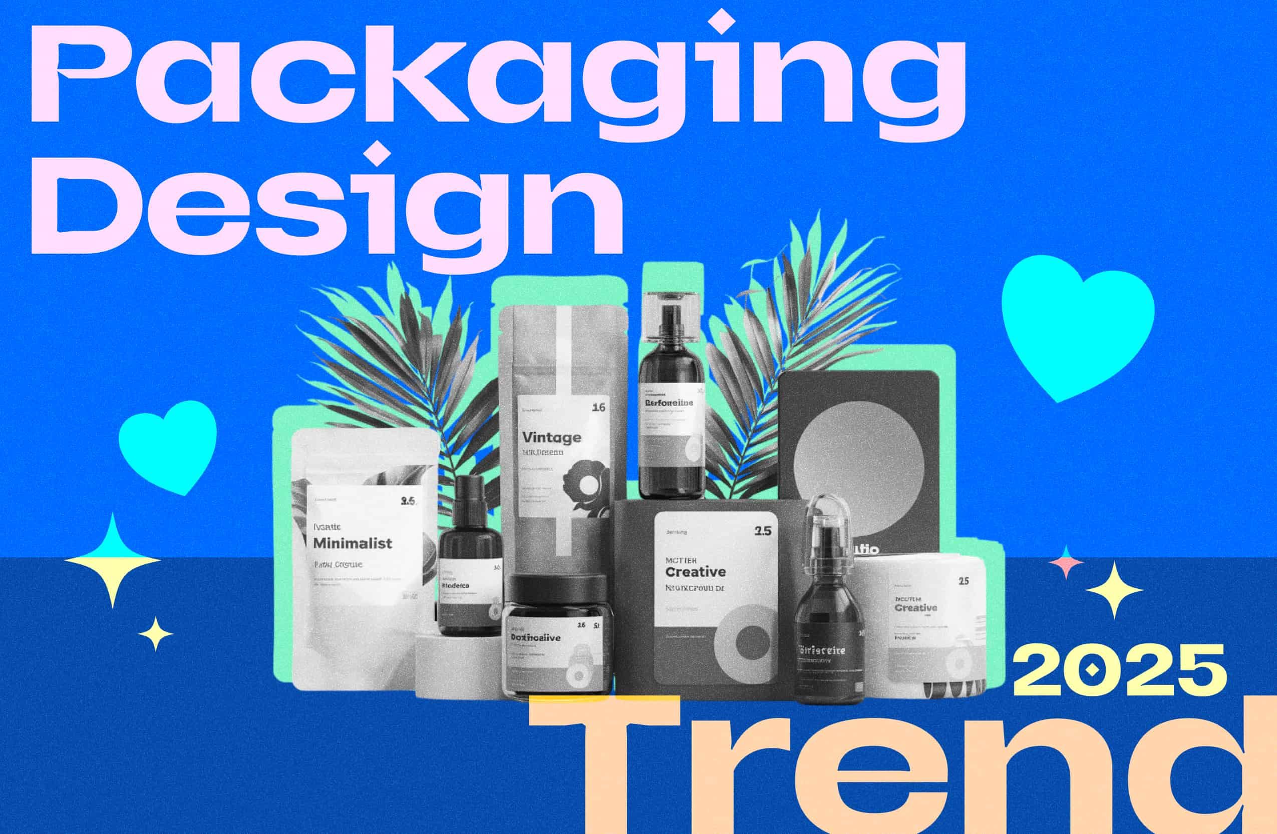
Packaging design has become an increasingly significant focus as brands continue to set themselves apart.
As more and more companies join retail and e-commerce, packaging design can be one of the best ways to stand out and create a fantastic customer experience right from the start.
Packaging design encompasses many different elements that help make it what it is, such as the structure, artwork, and typeface.
However, while a lot of attention is given to the structural design and artwork, the typeface is often overlooked.
But if chosen correctly, typography can help create a distinctive packaging design and plays a crucial role in the design process.
Using the right font can help with creating a strong brand impression and a memorable design that customers will love.
Typography plays a meaningful relationship in the design, the messaging, and the product itself during the design process.
It is a major part of the brand personality and can shape the customer’s impression of your brand.
Depending on the mood, emotion, and overall appearance, typography plays a pivotal role in creating the right experience.
Here we will explore the typography basics, the different kinds of typefaces available, how to choose the right font for your packaging and incorporating brand fonts into your packaging design.
What is Typography?
At its most basic level, typography refers to the technique of arranging letters and text.
The goal is to make it clear, easily understandable, and visually appealing so that customers gravitate towards it.
It encompasses the various types of font styles, structures, and how the text looks and feels as part of the packaging design.
Typography holds so much importance in packaging design because it helps customers form their impression, whether they can easily understand what’s written and use that to make their decision about the product.
When it comes to typography, having a basic understanding of the terminology and what it means for design can help you navigate typeface classifications easier.
Defining Type Classifications
Type classification is a way to categorize typefaces and fonts based on what they look like and the different historical times they were used in.
Getting a better idea of the font classifications allows you to narrow down your choices for your packaging, making it an easier process!
There are three types of classifications that we will take a look at.
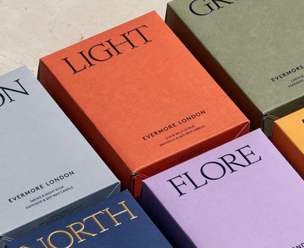
Serif
Serif typefaces are named after the short lines that extend from the open ends of a letterform.
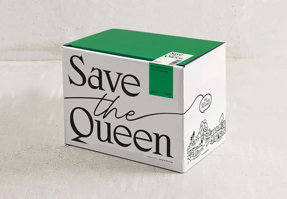
This is one of the typefaces you’re most familiar with since it’s used for books, newspapers, essays, and has remained a traditional font that many gravitate towards.
This type classification often communicates professionalism, sophistication and educational content.
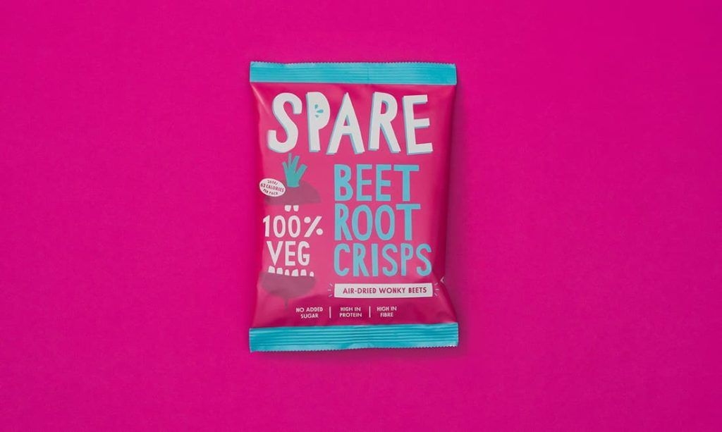
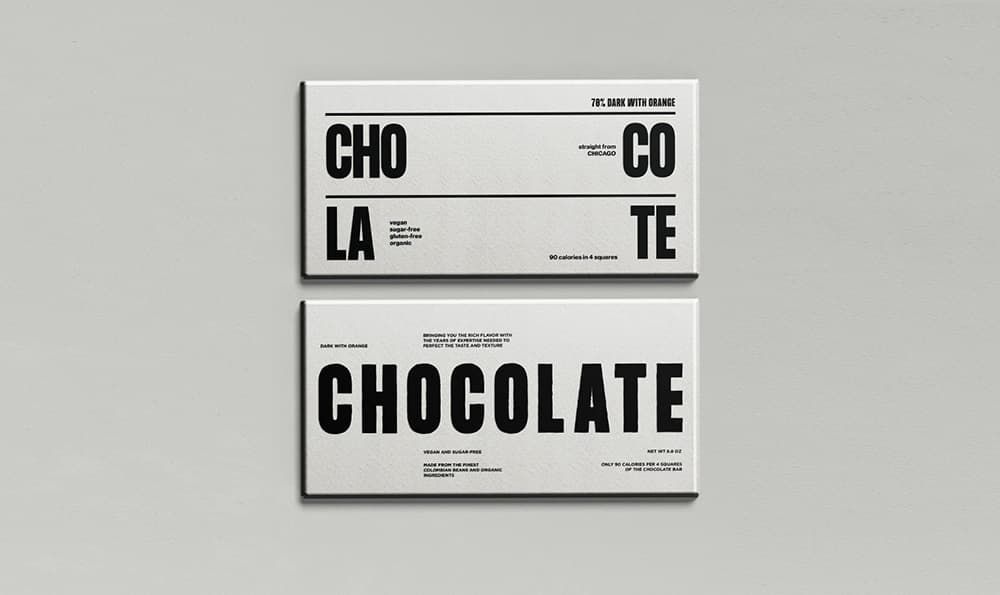
Sans Serif
Sans serif is a type of font that means “without” the line – so the opposite of a Serif typeface.
This type of font tends to have no lines or strokes extending from the letter form.
Sans serif is one of the best options if you’re looking for something modern without being too complicated or hard to read.
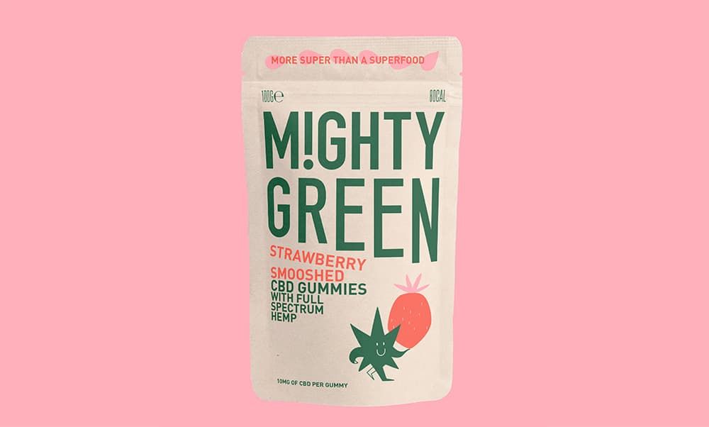
Sans serif is commonly used for products with a minimalist look and feel, something more high-end, and/or for a youthful look.
This type of font is most widely seen in electronics packaging and luxury brands as part of the narrative.
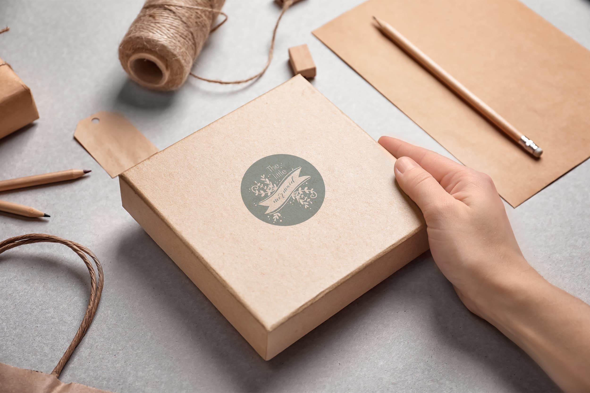
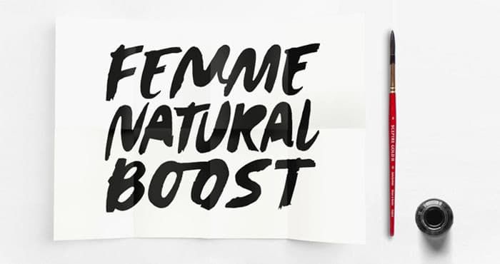
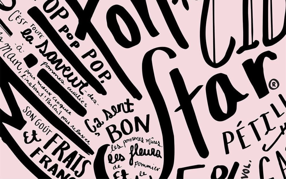
Script
If you’re looking for a font that reminds you of handwritten letters, a script typeface will be the best choice.
Some may connect letters, while others may have a different stroke weight to achieve a unique look.
Depending on the flourishes, strokes, and type of script, it can be used as a formal typeface or casual.
It is most commonly used for invitations and other documents that might want a more traditional touch.
It’s incredibly versatile, so you will find many examples of Script typefaces being used casually, such as the KitKat brand or more formal, such as wedding invitations.
Now that we’ve gone through the classifications for typefaces, it’s time to pick one!
Choosing Your Brand Font
So how do you choose the right font for your brand?
Well, the first step is to consider the brand identity and what you are trying to achieve.
Some questions to guide the process could include
- Who is your target audience
- What kind of look and feel appeal to them? Something casual, formal, high-end, etc.?
- What impression do you want your packaging to make?
- What kind of customer experience are you aiming for?
This will help narrow down your options and choose a typeface classification that fits best with what you want the brand identity to look like.
To make the final selection, it’s vital to go for a font that is easily legible, unique, and fits your brand well enough to make it as memorable as possible.
People make assumptions about the brand based on design and font choice, so selecting the right one will ensure that you create the right impression from the start.
But what if you already have a brand font you’d like to incorporate?
How to use Typefaces for Packaging Design
If you have brand fonts that you would like to add to your packaging design, there are some key points to keep in mind.
Thicker fonts tend to look best on design, as thinner fonts can be challenging to read on the packaging and may not work well with the rest of the design elements.
Similarly, italics and script typefaces tend to be challenging to read as well.
If you have a dark background in your design and plan on using white fonts, emboldening the font can be helpful as inks bleed slightly and may otherwise look smaller or disappear altogether due to optical illusions.
The general advice for bright and dark-colored packaging designs is to use bold fonts to print effectively.
In terms of sizing, the recommendation is that fonts should be 10 pt minimum for boxes being mailed/shipped and tuck top boxes.
If you have a folding carton packaging, 6 pt and above will look good.
And lastly, to ensure that your box prints without cutting text off, offset!
Having an offset on each side of at least ⅛-inch (.125”) will serve you well during printing as the text will print accurately.
Now that you have a better understanding of typefaces, fonts available and the impression they can make for your brand, you will feel a lot more confident during the design process.
There are many free and paid font options available so that you will have no shortage of choice!
Using the tips above will help create unique packaging that your customers will love and allow your brand identity to shine!
Looking for more advice on your custom packaging options? Contact a packaging specialist today.
Written by
5+ years in content strategy — building packaging case studies, guides, and blogs.