Key takeaways
Color matching aligns on-screen and printed colors so your packaging prints the shades you intend.
- 01The industry standard is the Pantone Matching System (PMS), converted to CMYK for print.
- 02Specify PMS or CMYK from the start to avoid mismatched results.
- 03Screen, material (matte, gloss, transparent), and lighting all shift how color appears.
- 04Get closer by calibrating your screen, soft-proofing, and using a color library like Pantone.
- 05A perfect screen-to-print match is impossible; request prototypes to confirm the result.
Getting the colors right is a fundamental part of your branding and packaging experience.
However, translating colors to the physical packaging and getting an exact match can often be challenging for designers.
What’s on the screen can greatly differ from the physical product, and even if you choose colors strategically, it can be stressful when you see they just don’t match the way they should.
This article will explore the color matching process in more detail, the different types of shades, and other factors that can lead to a less-than-perfect color match.
What is the Color Matching Process?
The process of colour matching is to find and approve colours that match on-screen and off-screen.
This ensures that colours that you see on-screen are accurate once the design is printed.
The process entails looking at the hue, saturation, and brightness of the colours on-screen and making sure they are reflective of what you will see when you receive the final product.
So how do you actually match up colours?
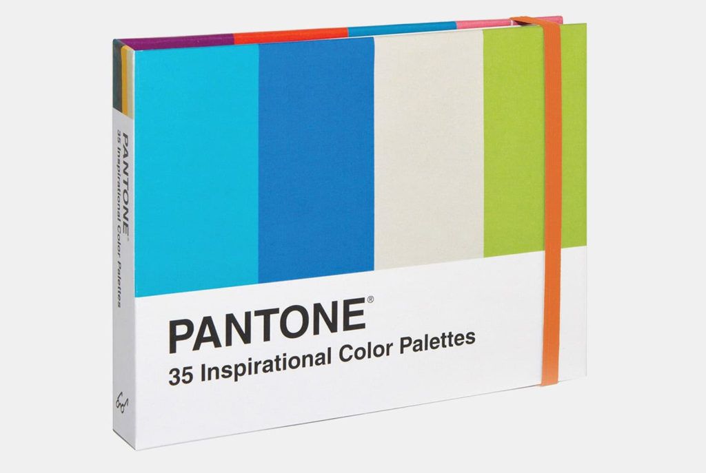
The design industry standard is to use the Pantone Matching System.
The benefit of this is that the colors are standardized and used globally, so there is little worry, error or confusion.
The colors can be matched to customer preferences and needs for both digital and screen printing.
The PMS colors that you see will then have to be matched to a computer equivalent, CMYK, for accuracy.
We’ll first look at the Pantone Color Matching System in more detail before moving on to PMS and CMYK.
The Pantone Color Matching system (PMS) has become a global standard in design that is operated by Pantone Inc.
Pantone has been able to establish themselves in this realm through their success in naming pretty much all tones of color (perhaps excluding a few yet to be discovered!).
The range and depth of colors available have made it easier for the global industry to adopt this system.
Color is notoriously difficult, especially with different monitors, brightnesses, settings, etc.
Having one system in place, such as Pantone, can help eliminate a lot of confusion and create a smoother design process.
The process relies on a numbering system as a code for specific colors.
It is used for design, manufacturing, fabric, and a multitude of applications thanks to its wide catalog of colors and easy standardized system.
We’ll now look at the role of CMYK in the design process.
Learn more about the Pantone Color Matching system and how to use it effectively!
Distinguishing between CMYK and PMS
During the design process, you might get asked whether the colors you have provided are CMYK or PMS.
As designers, we know this is a standard question, but we see a lot of confusion from business owners who don’t quite know the details, so we thought we’d demystify this question!
CMYK stands for cyan, magenta, yellow and black. You’ll typically see this at your office or home printer, you have even replaced the CMYK ink cartridges yourself. PMS stands for the Pantone Matching System, discussed above.
When you’re printing packaging and logos, the colors you are thinking might not be the colors the designers have in mind.
For example, you could provide a PMS color that you have picked, but if it is not specified that it’s chosen from the PMS system, the designers could try to use the CMYK equivalent, this is also true the other way around.
That is why it’s vital to get this question established from the start before printing anything!
By specifying the color system you have picked your colors from, you’ll be able to ensure accurate results every time.
But what exactly can affect the color matching process?
What Affects the Accuracy of Color Matching?
Many factors can affect colour matching, particularly if there is no system such as CMYK or PMS in place.
Screen printing versus digital material, and lighting can all affect getting a perfect match.
Brighter versus dimmer lights can change how the eye perceives colour in person, and different screen settings and office lightings can affect how the colour is perceived on a computer or phone.
We’ll now explore the colour matching process in more detail so you can get the perfect shade for your packaging!
The Screen
Various factors can impact color matching in processes such as screen printing.
Here are a few things to look out for as they may affect colour matching:
- screen mesh count
- mesh type
- squeegee sharpness
- The angle and pressured
- The curing process
However, the benefit of screen printing and why it’s used so widely is that you can get a broader range of colours compared to digital – particularly fluorescents, metallics, and chrome.
CMYK, on the other hand, can only produce colours from the ‘four colour process,’ which includes cyan, magenta, yellow and black.
This makes getting specific colours harder, and they may not be as bright or intense comparatively.
There will also be differences in the shade if you go for coated (i.e., glossy) or uncoated materials.
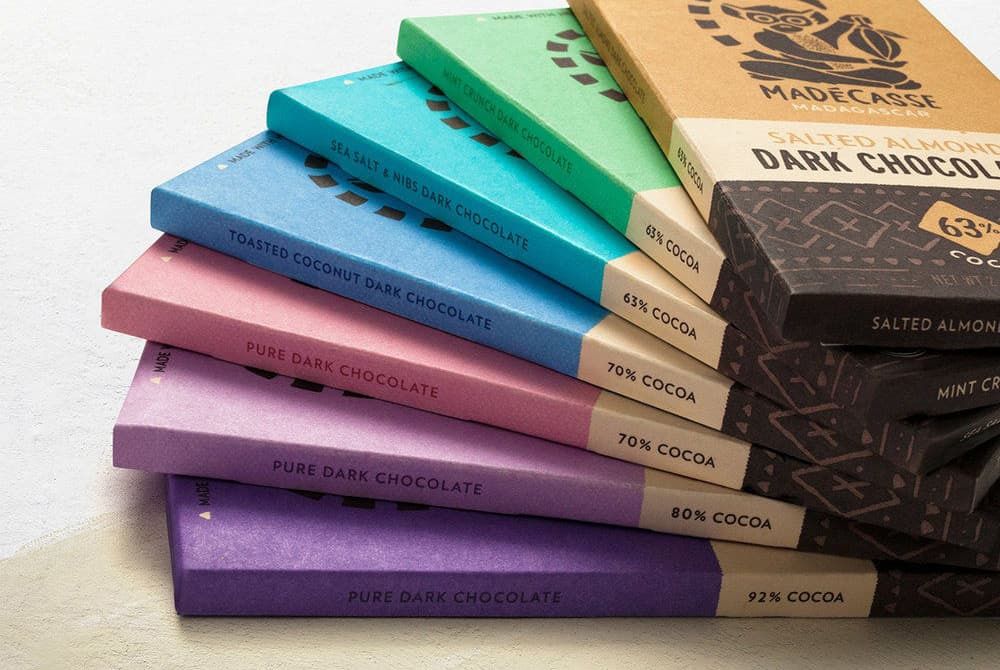
The Material
The material you choose for your packaging can change how the colour appears.
Why is this?
Because most of the materials used for graphic overlays and labels are made of
Polycarbonate or Polyester.
Your print (and thereby your colour) will either be 1st surface or 2nd surface.
If it is 1st surface, that means the ink will be applied to the top surface of the substrate, and it will be readable when looked at from the top.
The 2nd surface is when the ink is applied to the backside of the material. The image will be mirrored, and when the sheet is flipped, the image will be visible and protected by the material used.
If you opt for a 1st surface print, the ink colour will only impact the material colour itself.
You will also need to consider whether an overlaminate needs to be applied to protect the ink or the appearance.
For example, if you use a matte overlaminate to black ink, the resulting effect will make it look dark gray rather than black.
If you decide to go for a 2nd surface print, the material you choose will make a big difference to the end result.
Matte, textured, and gloss material all have an impact.
If you opt for something matte or textured, the light diffusion may make the shade appear less bright than gloss.
Even if a material is transparent or clear, it still has a natural colour that will need to be taken into account during the matching process.
The Lighting
The other consideration for colour matching? Lighting.
Colour is a property of light, and we see some shades because they are absorbed, and others are reflected.
Sometimes, this means that the colour matches exactly the way we want in one light while looking vastly different in another light (think indoors vs. outdoors and how the light changes the colour of what you are looking at).
Digital printing can also impact the way colour is perceived since the ink may drop down differently in digital printers and may reflect light in a way where they look low quality.
So when trying to colour match, try to hold the shades in different lighting and focus on the one you know will be most common.
This will help you pick a more accurate shade to what others see when they receive your packaging and in turn create a successful unboxing experience.
How to get an accurate Color Match?
Getting accurate color matches is a challenging task, even for the most talented designers.
You will never get a perfect match to what you see on your screen. However, you can get it pretty close with the right tools and time.
So, what do you need to get the closes color match possible?
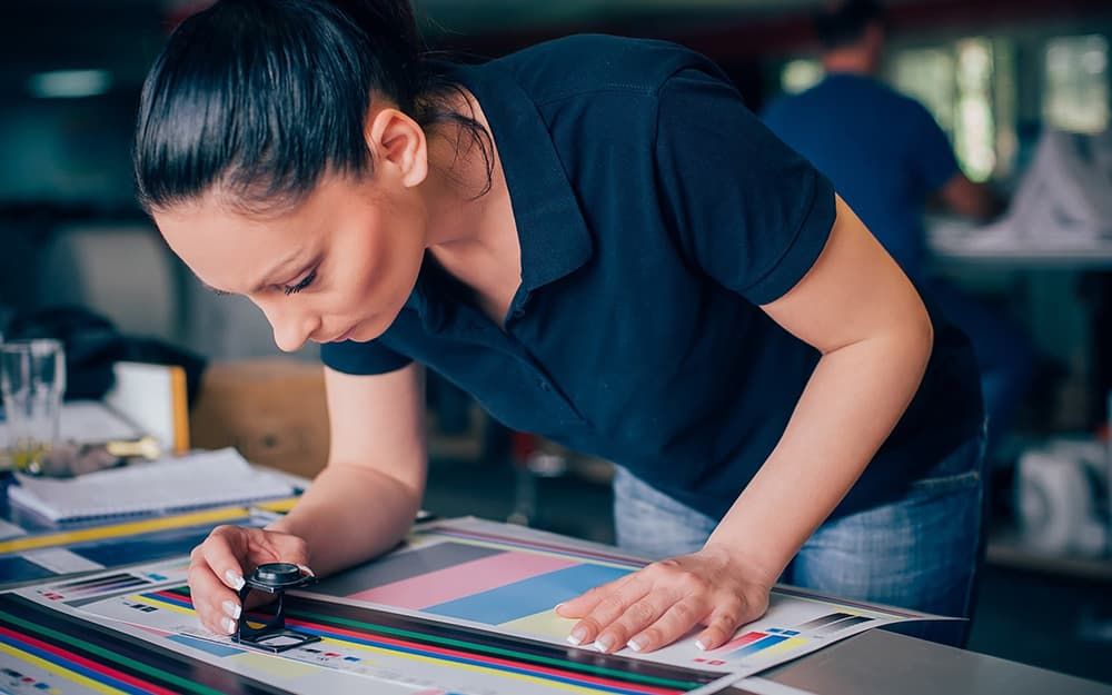
Calibrate your Screen
Making sure your screen is reproducing accurate colors is the first step to getting the closes match possible.
Make sure to check your display and printer settings and run it through a calibration cycle on your computer.
For Windows computers you can follow this guide on how to calibrate your monitor colors effectively.
For Mac computers please follow this guide for color calibration settings.
Essentially, the built in color calibration tool in your printer will print out blocks of color that you can compare to the colors shown on your screen. You can repeat this process until you get a color match that is close enough.
Soft-proofing
Besides printing out digital copies of your work and calibrating your printer, you can also simulate the printed look on Photoshop, to get a some-what accurate idea of what the printed version will look like.
To access the the soft-proof option on Photoshop follow this guide.
If you have a specific printer or paper stock you are working with, Photoshop will allow you to set this up as well to help you get a better idea of what the output will look like.
If you’re not working on Photoshop for your project, it’s not the only software that allows you to soft-proof.
Make sure you check the soft-proof settings for your preferred software to ensure more accurate color matches before printing.
Use a Color Library
This is probably the best and easiest option for producing more accurate color outputs.
Systems like the Pantone Matching System, can feel like an expensive option, but it is definitely worth it especially when working with branding and packaging.
If you are working with a designer, they can present you with much more accurate color outputs using Pantone colors, which gives you a better understanding of how your branding will look on different substrates.
The Importance of Color Matching in Packaging
Packaging is arguably the strongest marketing tool at a businesses’ disposal.
When designing your custom printed packaging, you can create an amazing impression using branding elements to create an exceptional experience for customers.
Packaging is the customer’s first impression of your brand in many ways, and with the right colors and design, you have a chance to wow your customers right from the start!
However, different materials accept ink in different ways, and this is definitely something to take into account, especially when color matching.
Color matching plays a crucial role in the branding of your packaging. With a chosen material, you can start color matching based on the substrate and how it accepts inks and colors.
The best way to do this is to request prototypes of your packaging.
While they may be lower in quality in terms of printing (should you choose to get a digitally printed prototype to save on costs), you can get a good idea of what your end product will look like and how your colors translate from monitor to packaging.
Read more on the importance of requesting prototypes.
Looking for more advice on your custom packaging projects? Get in contact with our packaging experts to help make the right decisions for your business!
Written by
Former journalist turned packaging researcher, focus on technical content & industry news.